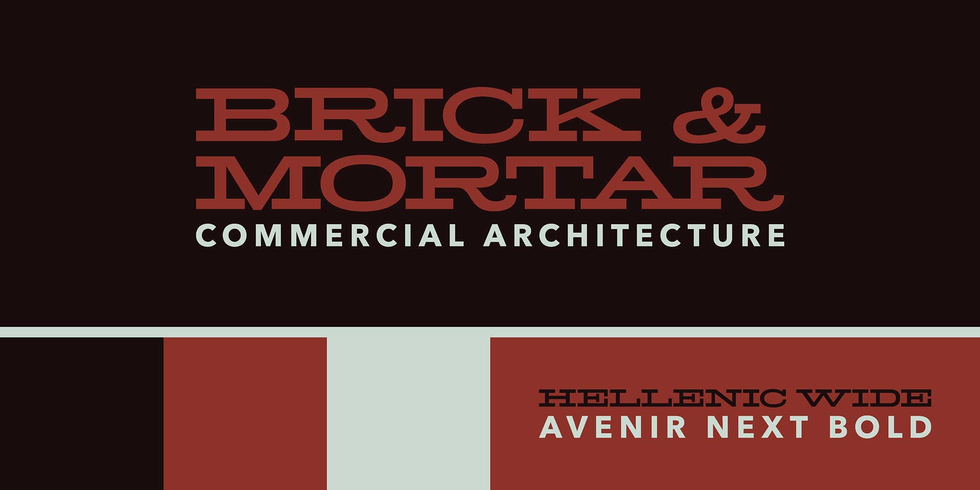
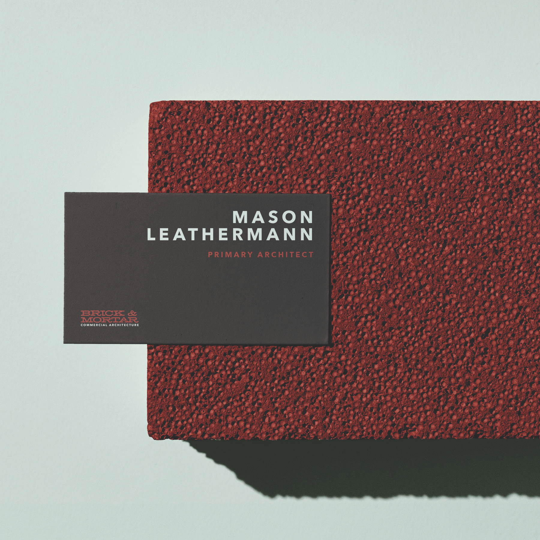
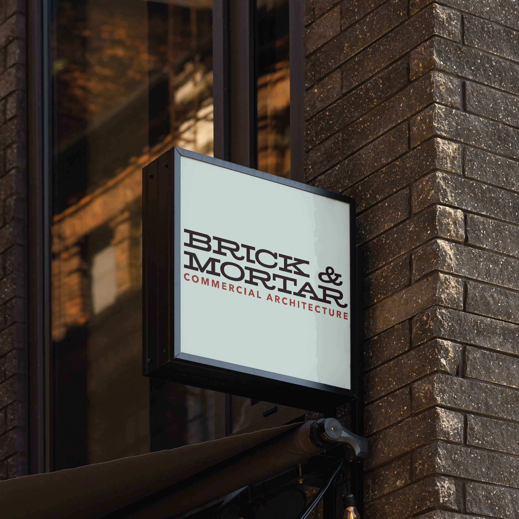
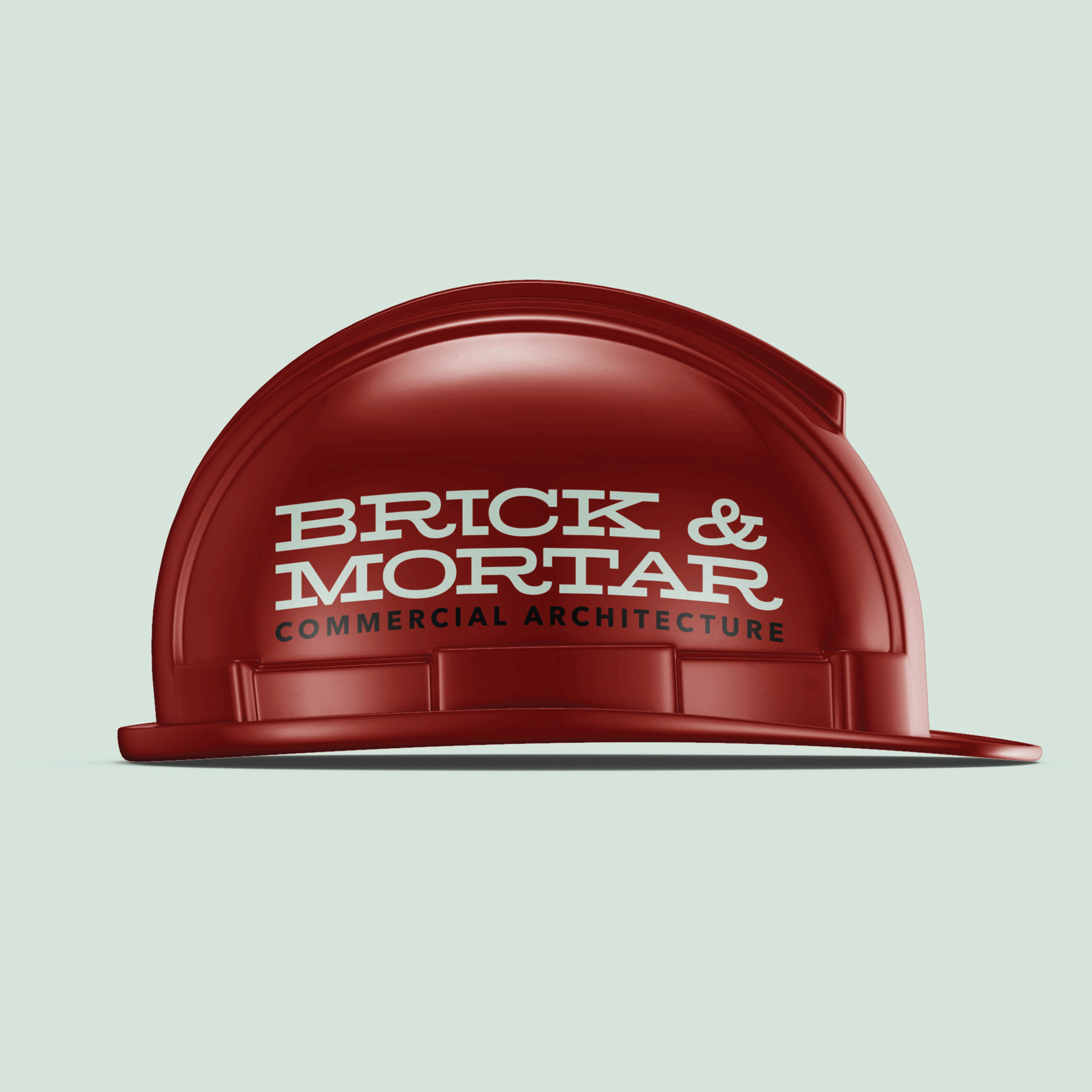
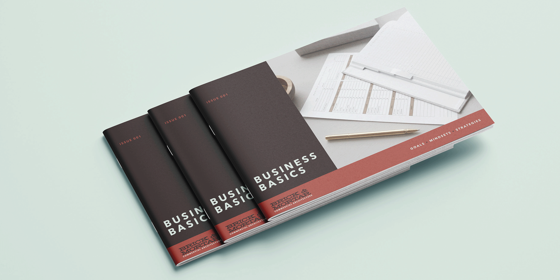
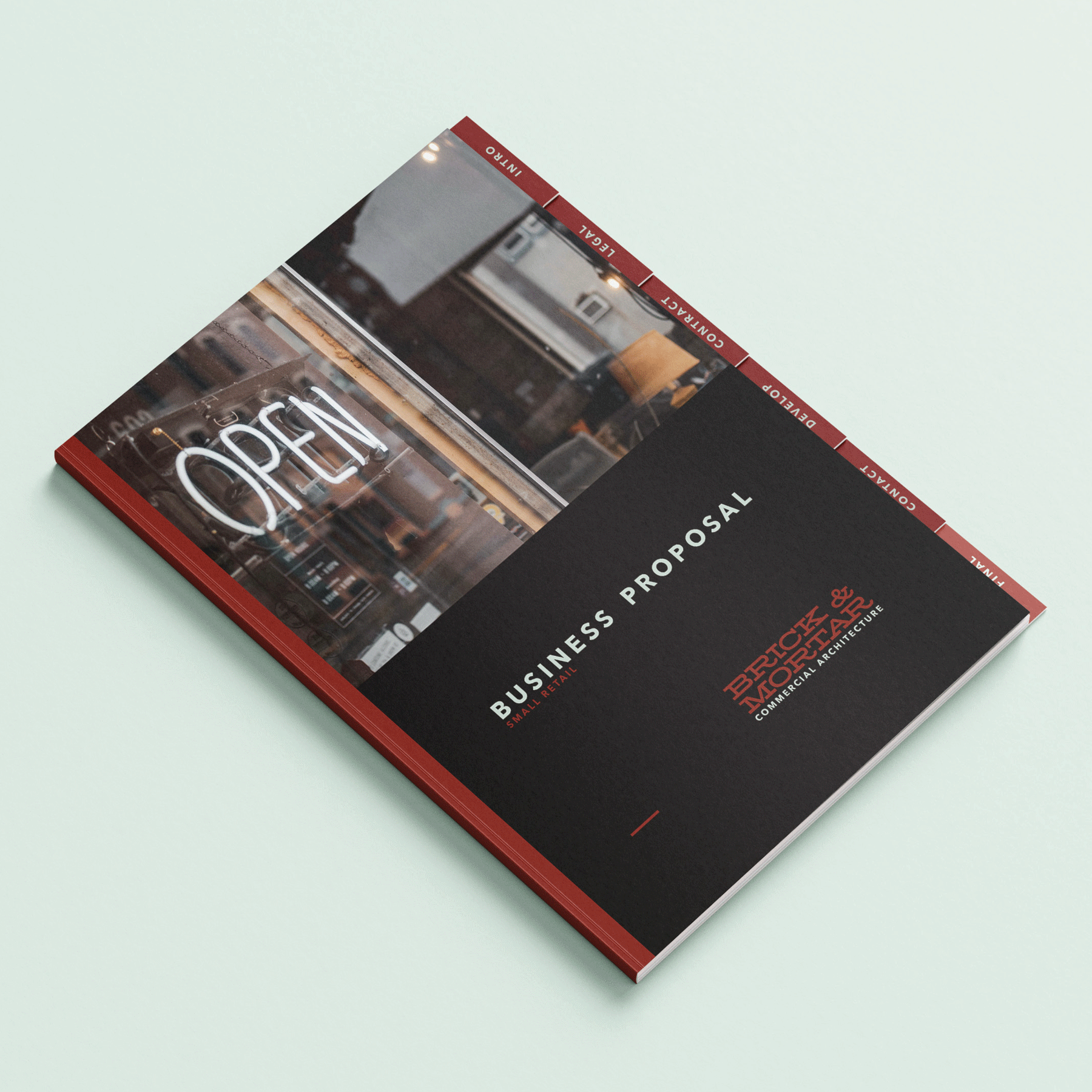
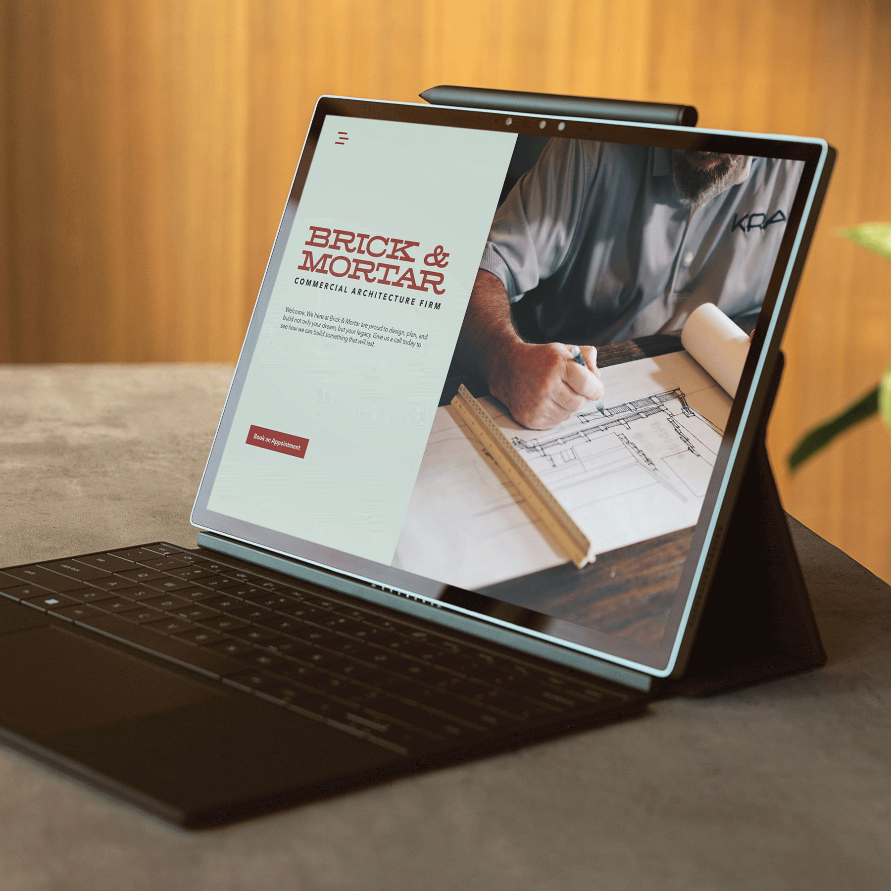
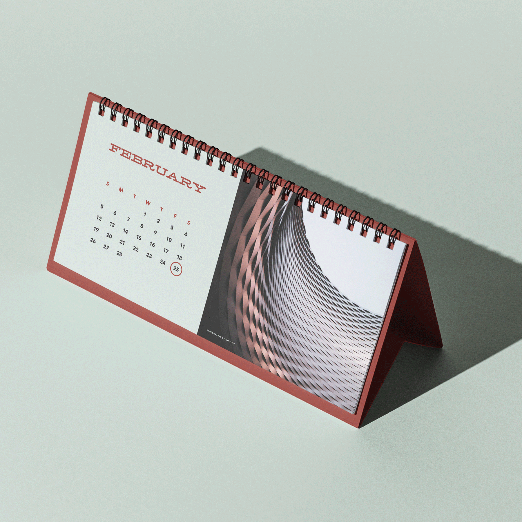
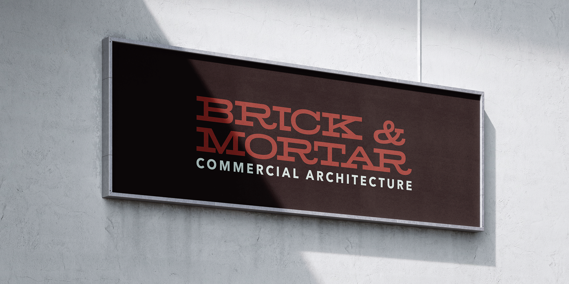


Brick & Mortar focuses on architecture for the small businesses that help America thrive. The brand’s complementary color palette pulls from the same inspiration as the name of the business. With the primary typeface hearkening back and its secondary typeface focusing on the future, the brand’s design conveys the heritage and longevity of the firm’s work. A strong consistent grid gives the feeling of stability and reliability.